

If we could see it, would we stop it?
Making carbon pollution visible.
Cross-posted at The Berkeley Blog.
It’s difficult to see something as a problem if we can’t see it at all. That’s one problem with coming to grips with greenhouse gas pollution. It doesn’t show up in the air the way smog does, and its impacts aren’t directly linked to emissions in perceptible ways.
Interestingly, it turns out that’s not just a challenge, it’s a business opportunity. Carbon Visuals is “a business dedicated to helping everyone better understand carbon emissions.” They produce graphics like the pictures to the left and below, designed to help bring home to people the scope of the carbon pollution problem and their responsibility for it. Browse their web site a bit. You’ll see all kinds of interesting pictures and ideas. If you’re trying to communicate the seriousness of climate pollution (and can afford their services), Carbon Visuals is ready to help you.
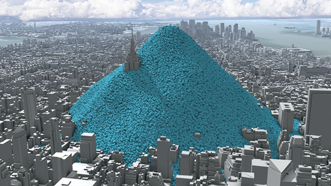
I’m fascinated by what it takes to get people to connect emotionally to a problem like climate change. I applaud Carbon Visuals for its efforts. It seems to me that their visualizations make two of three necessary points. First, they do a great job of showing the sheer scale of carbon pollution. The picture of the Empire State Building disappearing under a single day’s carbon emissions is hard to ignore. They have others showing CO2 in the atmosphere as a quilt layer, getting thicker and thicker with time. It’s astonishing to me how much we’ve changed the composition of the atmosphere in my lifetime, and Carbon Visuals has some pretty arresting ways of making that visible.
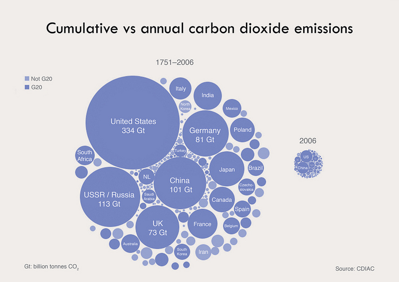
Second, they’ve got graphics that provide comparative information about emissions over space and time. That’s also a vital aspect of bringing a problem home — you can’t understand whether you or your nation could do better unless you know how others compare. This simple graphic, for example, shows emissions by nation, both since the industrial revolution and for a single recent year. It strikes me as a great starting point for discussing the equities of imposing uniform or differential emission limitations by nation.
But there’s an important, and contested, piece of the greenhouse gas picture that doesn’t jump off the pages of Carbon Visuals’ illustrations. That’s the impact of those emissions. Striking as those blue spheres burying New York City are, if they aren’t actually hurting us it doesn’t matter how big they are. For those who are already convinced that greenhouse gas pollution is a serious problem, Carbon Visuals’ pictures are useful tools for highlighting relative responsibility and the importance and possibility of changing behavior. But I suspect they’re not great tools for convincing skeptics of the importance of addressing carbon pollution.
Reader Comments
4 Replies to “If we could see it, would we stop it?”
Comments are closed.

About Holly
Holly Doremus is the James H. House and Hiram H. Hurd Professor of Environmental Regulation at UC Berkeley. Doremus brings a strong background in life sciences and a comm…
READ more
Very neat, thanks for sharing.
I particularly enjoyed their DIY page: http://embed.carbonvisuals.com.
Holly,
How can we emotionally connect people to climate change? This is a great question that needs an answer if we are going to continue to effectively engage all citizens.
Here in LA, we believe that the best way to spur action is to connect the dots – working with Angelenos and leaders to show how climate change is real, happening in our neighborhoods, and directly effecting all of our lives. Check out C-CHANGE.LA to see local science (courtesy of UCLA researchers) and local solutions that are creating a better city for us all.
Thanks for a great post!
Thank you for this blog. We too are fascinated by what it takes to get people to connect emotionally to climate change.
An important audience for us are the people who are yet to be convinced but are capable of making a decision and a difference on this issue, on whatever scale.
Our aim is to produce visuals that communicate the data clearly. Importantly, our images are deliberately non-confrontational. The range of NGOs and businesses (from very small charities to large corporations) that we work with have their own objectives in delivering information with clarity. But whoever we work with, ultimately we want people to understand what the numbers look like so when emissions are discussed it is a conversation that people understand, are empowered by and therefore actively engage with.